Ari Design
Personal Brand Identity
Procreate - Photoshop - Illustrator 2026
Project: Personal/College Work
Audience: Potential clients, employers, and creative professionals.
Purpose: Visual identifier of me as an artist/designer.
Style: Minimalistic
I wanted my branding to look minimalistic so it wouldn’t distract from my artwork. My brand identity is clean and uncomplicated, yet open and adaptable.
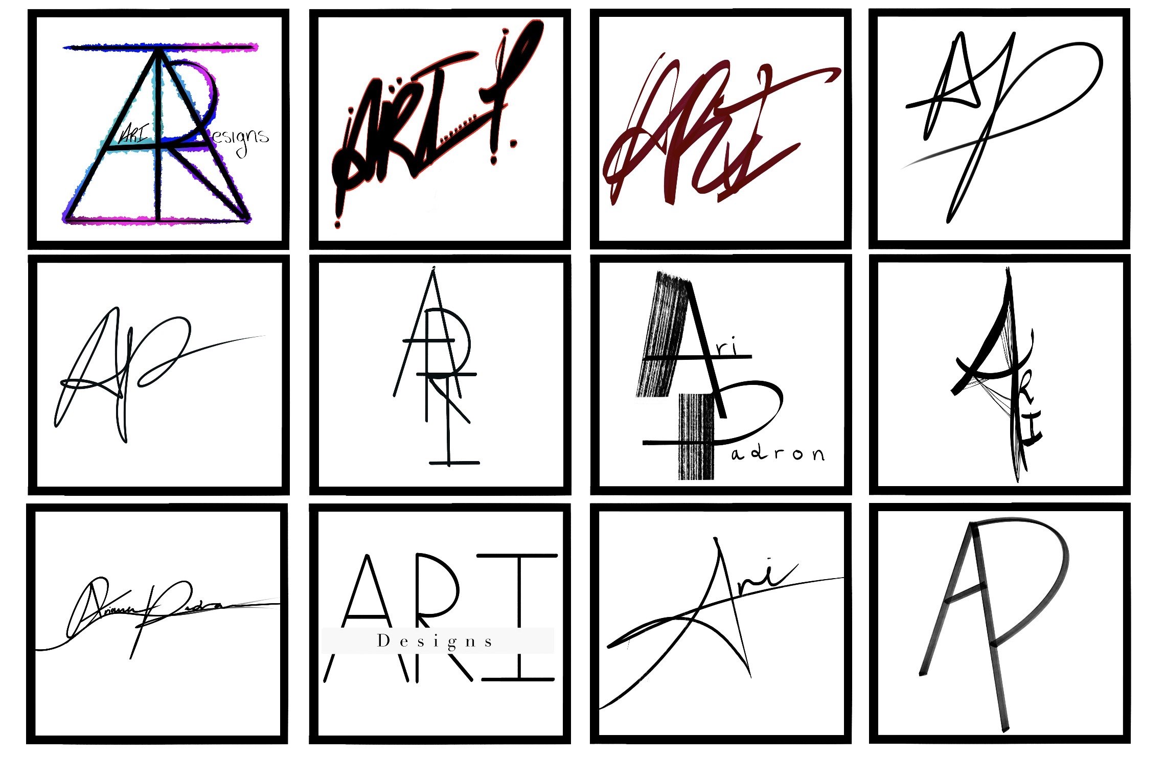
Sketches/Brainstorming
At first, I started coming up with different design approaches. Typed, signature, geometrical, graffiti, etc.
Something short and identifyable.
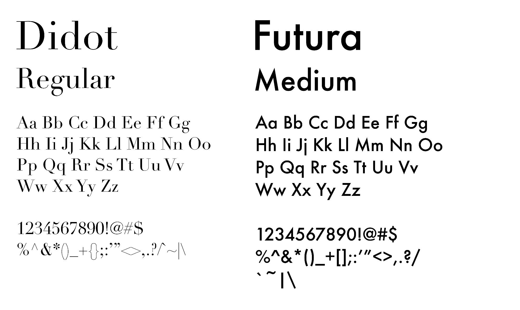
Typography
I chose Didot and Futura to effectively balance sophistication with simplicity.
Didot adds a refined, luxurious quality to my branding, while Futura’s geometric forms create a clean, organized, and professional contrast.

Final Logo
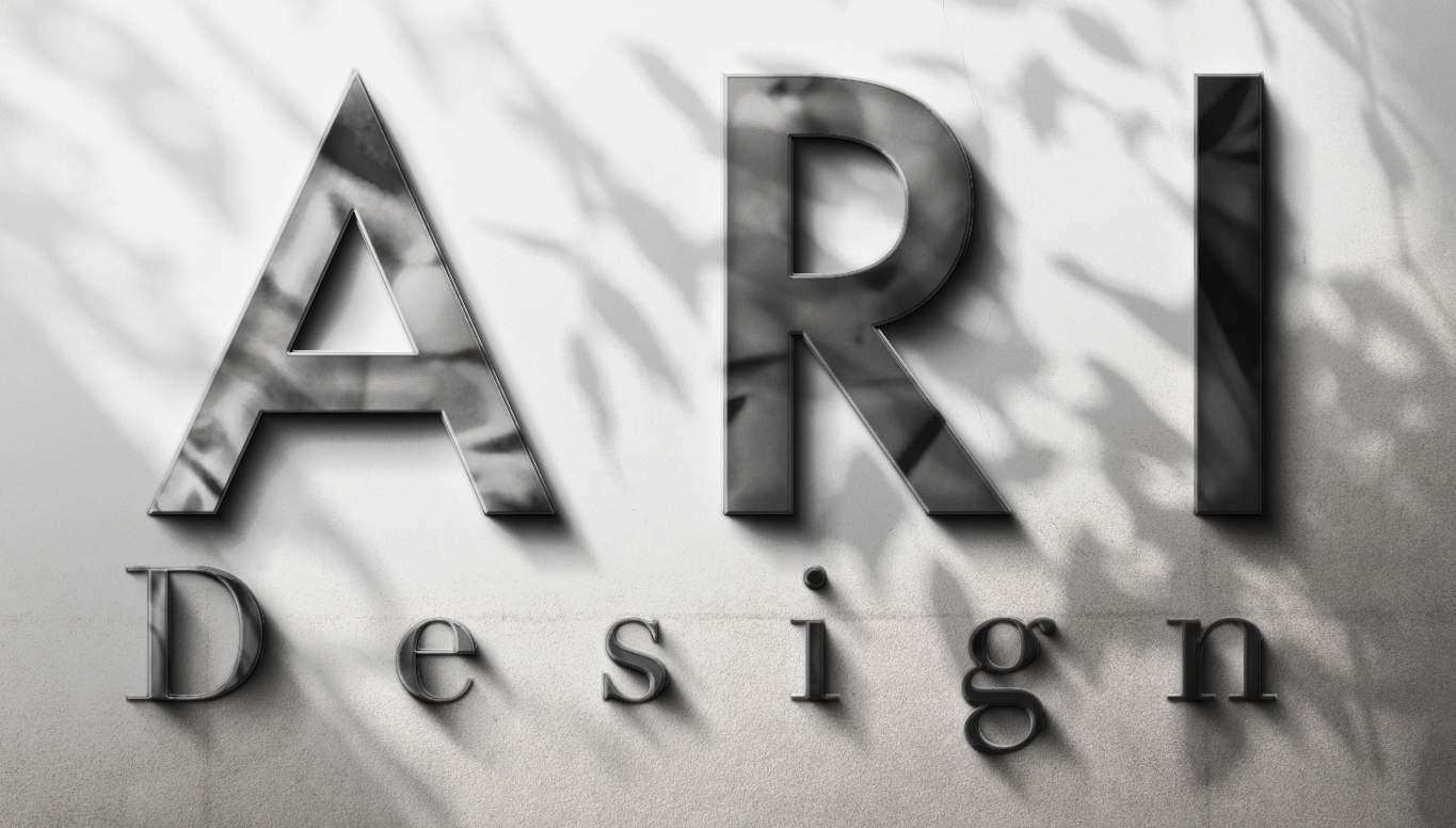
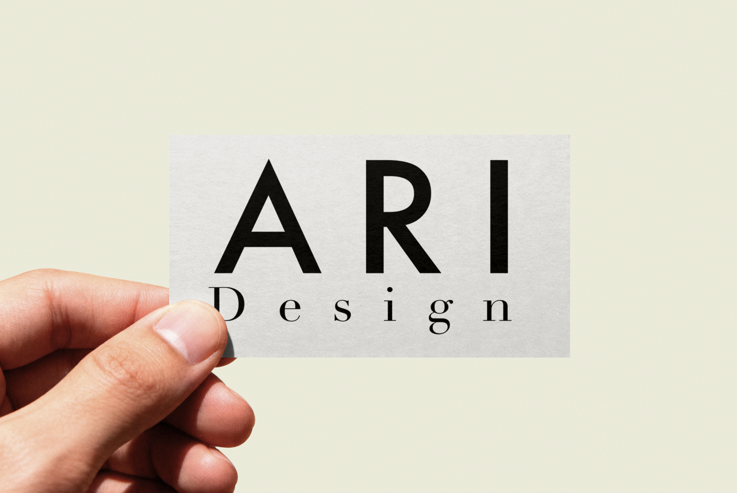
For my final logo, I wanted something simple, recognizable, and adaptable. The bold Futrua lettering gives “ARI” a strong and professional presence. The word “Design” in Didot adds elegance and contrast.
The difference in size, line weight, and spacing all create a clear hierarchy while keeping my logo minimal enough to complement my work.
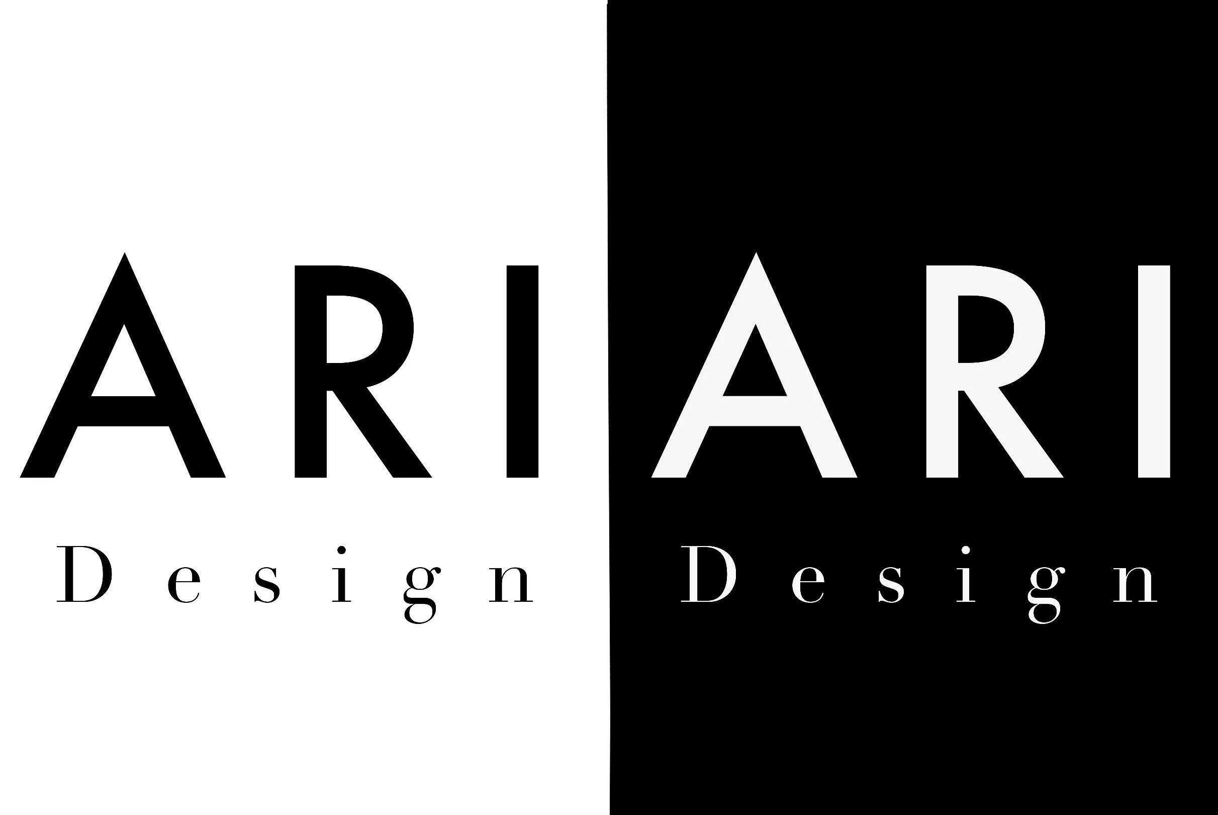
Black & White
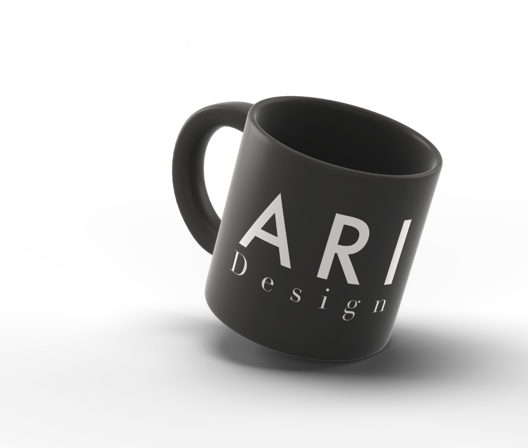
Both designs remain legible against light and dark backgrounds.
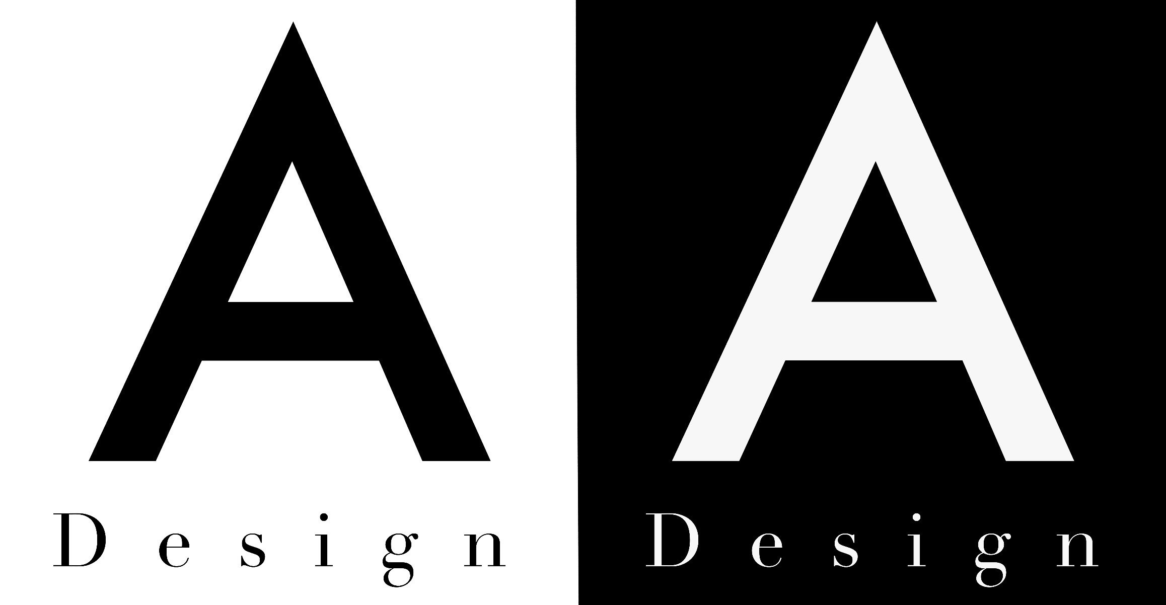
Favicons
I simplified my logo to focus on the “A” for Ari while keeping “Design” underneath. I wanted my favicon to remain consistent with my full logo even at a smaller scale.

Animation
I used glitch effects, distortion, and color separation to disrupt the otherwise clean and minimal logo. The animation brings my branding a darker, more experimental personality that allows me to still keep the original design recognizable.