Visual Sequencing Book
InDesign - Procreate - XD - Photoshop 2024
Thalassophobia
Project: College Work
Audience: Mature readers, individuals interested in Man vs. Nature elements, & natural/psychological horror.
Purpose: Understand the process of printing, book layouts, and proper time management.
Style: Claustrophobic/On-edge
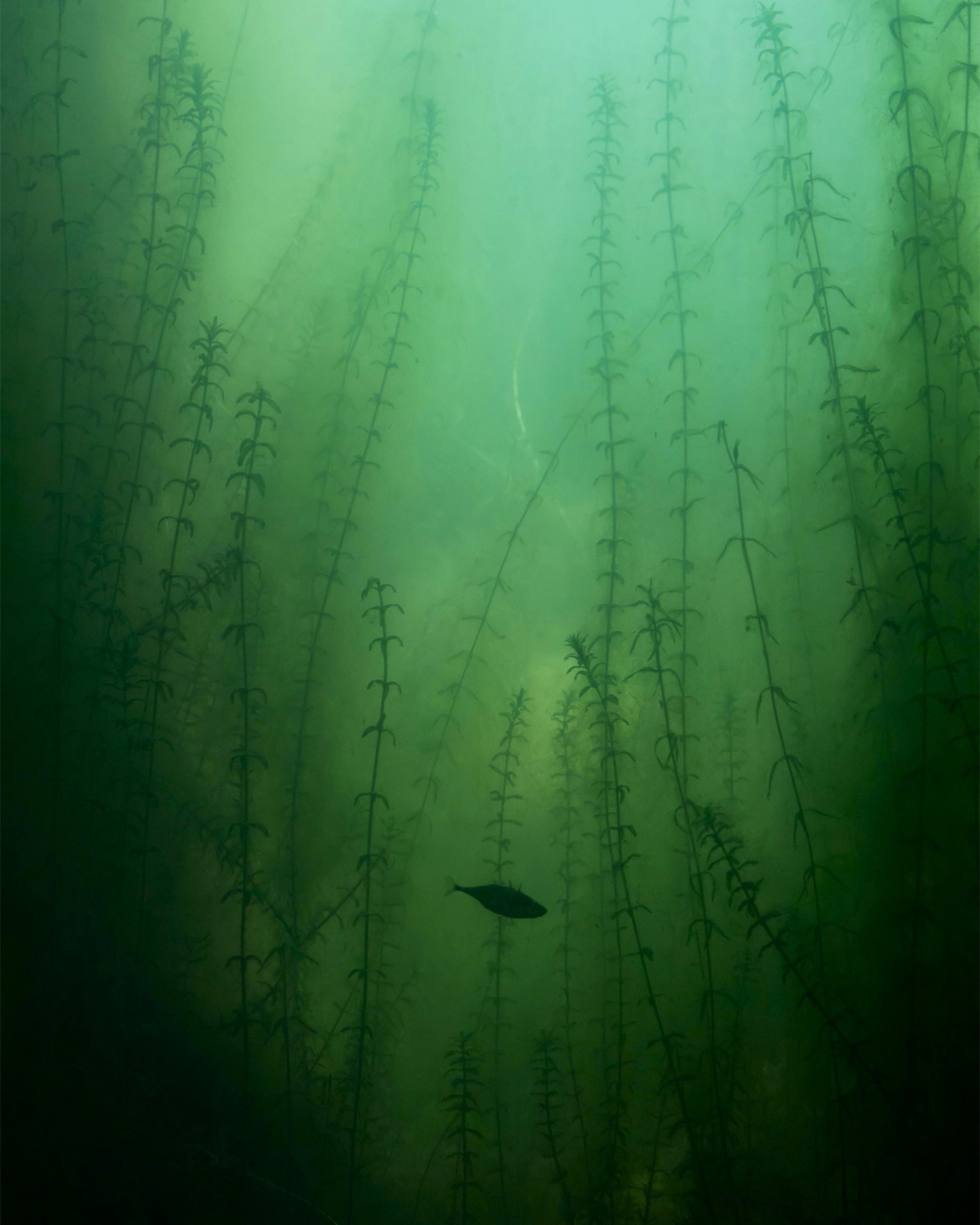
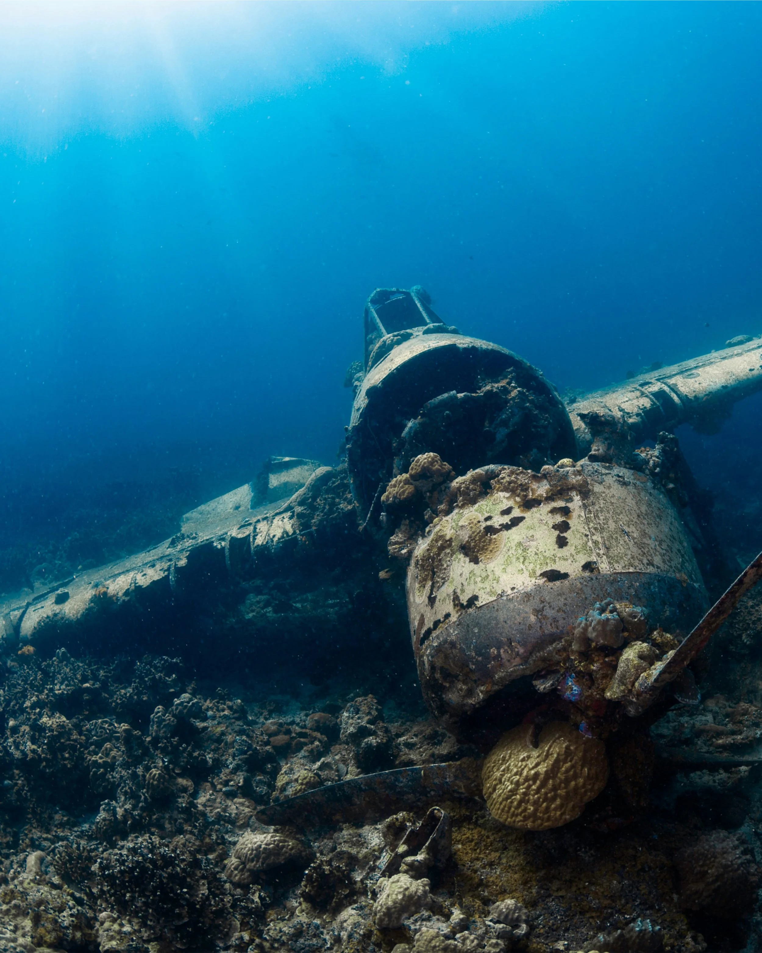
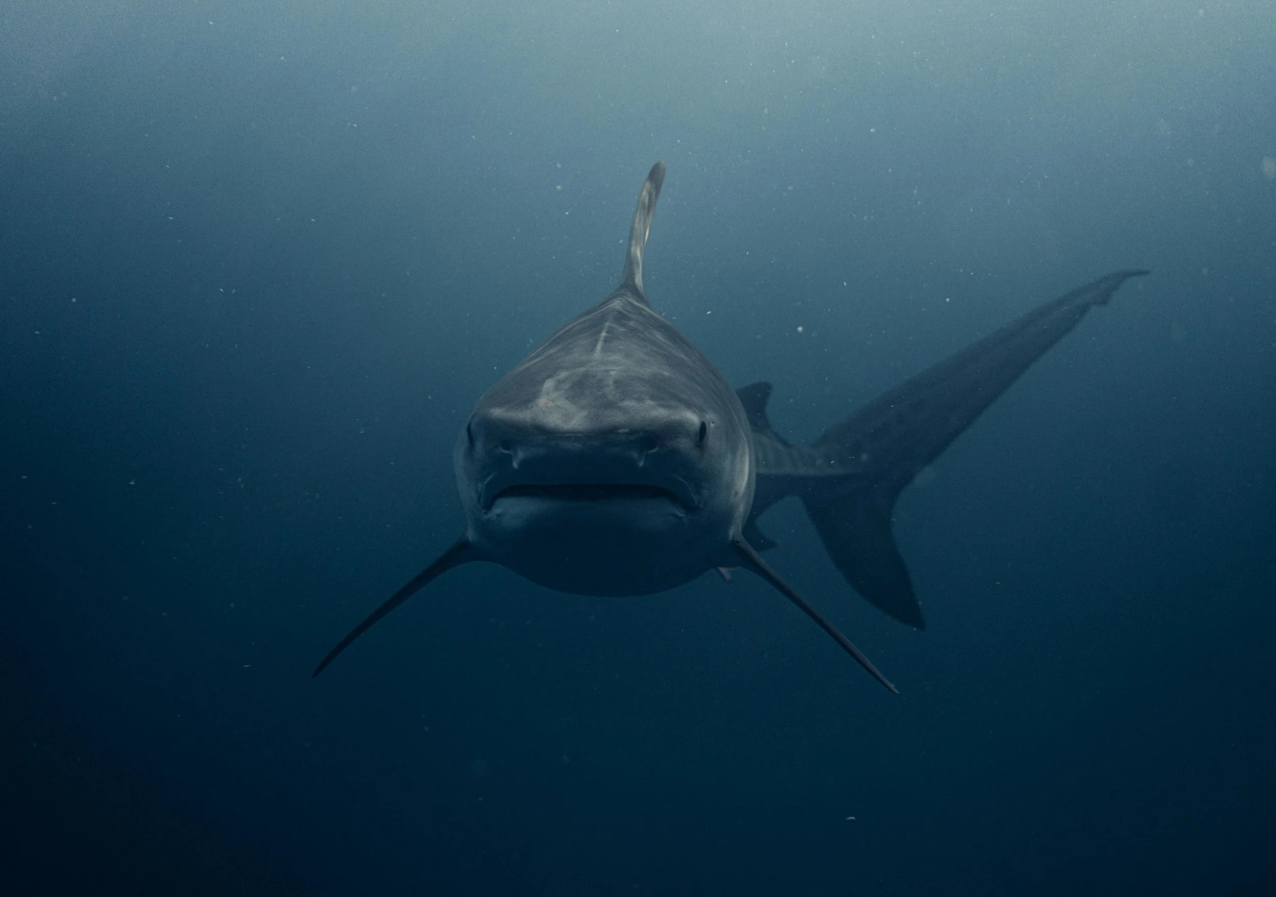
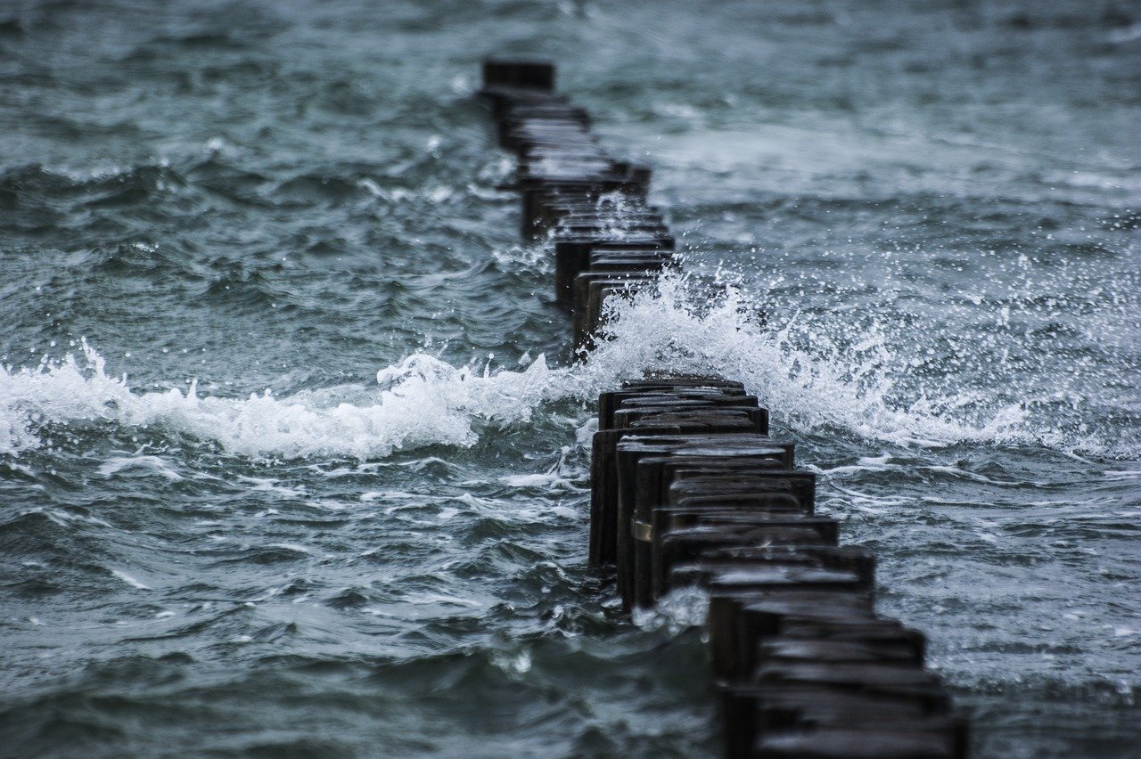
The goal was to create and publish a story from only a collection of images and our imaginations. Nothing else.
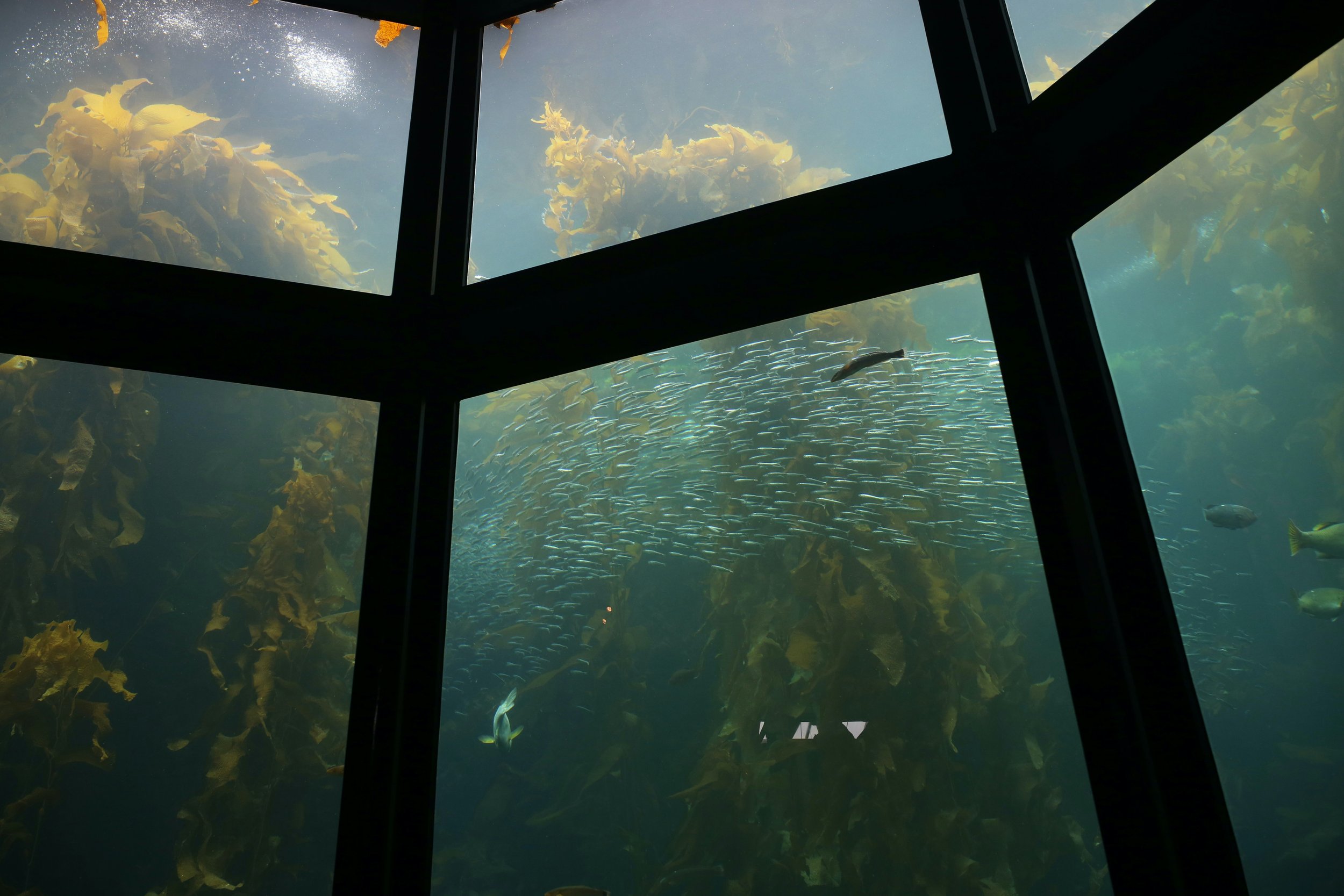
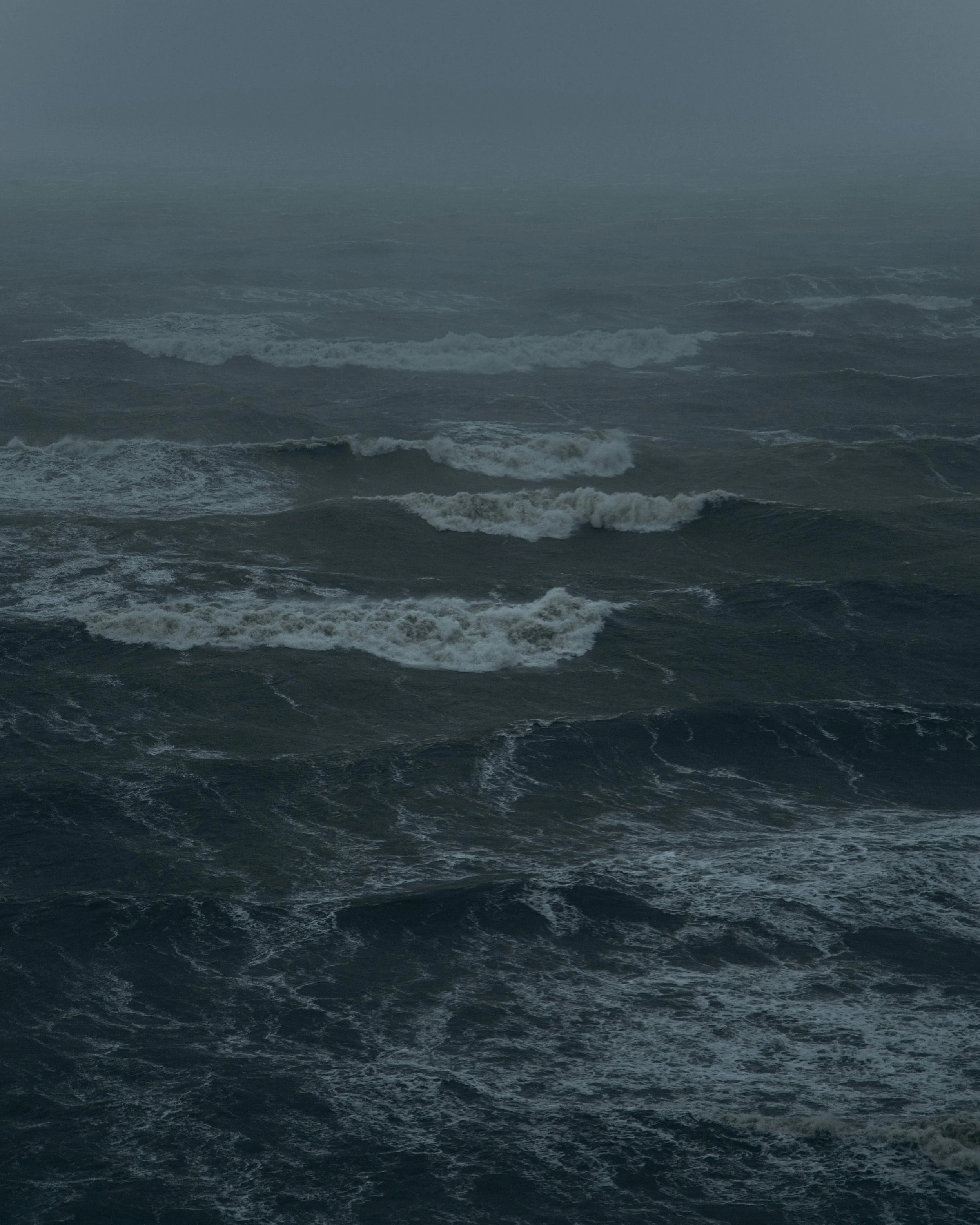
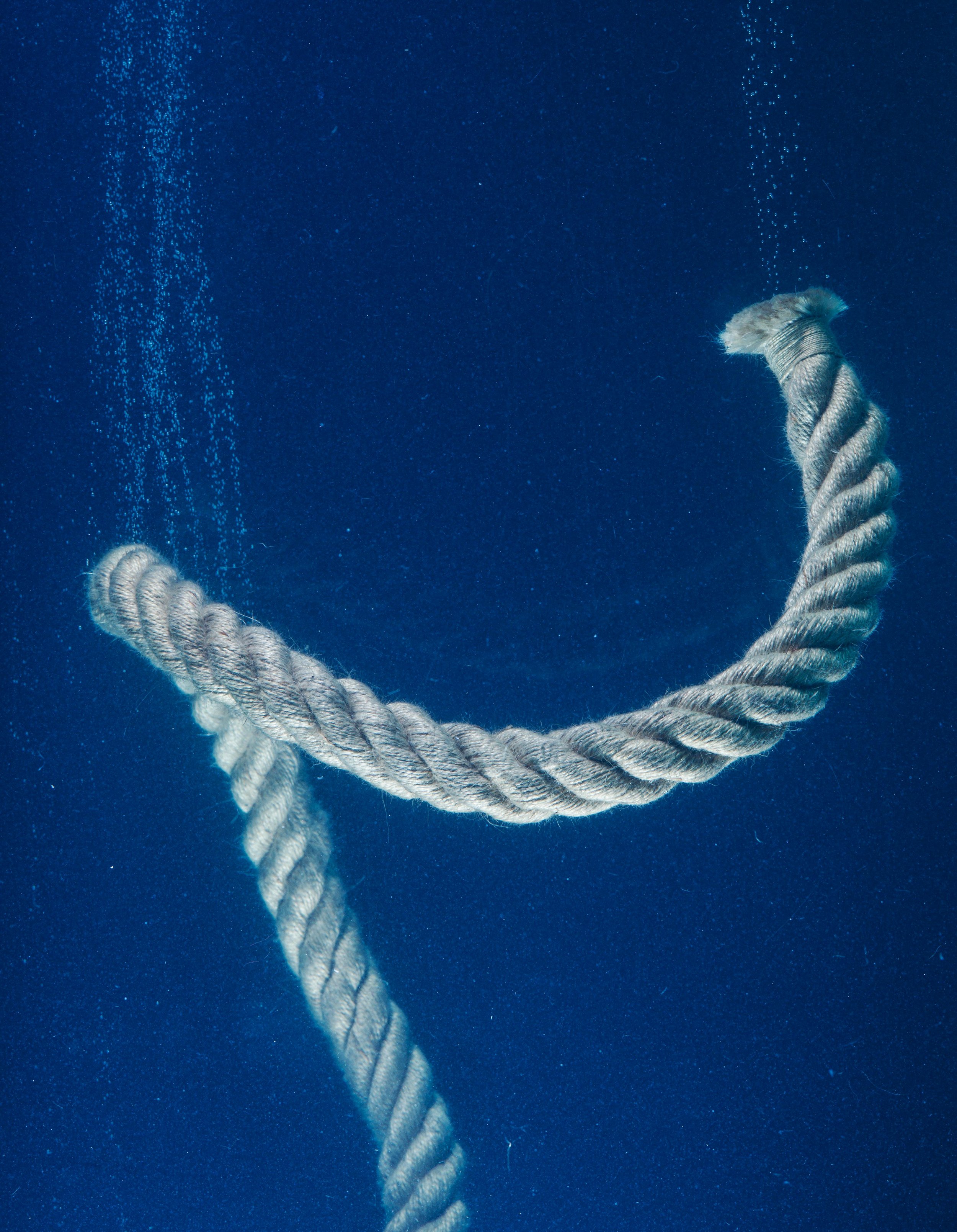
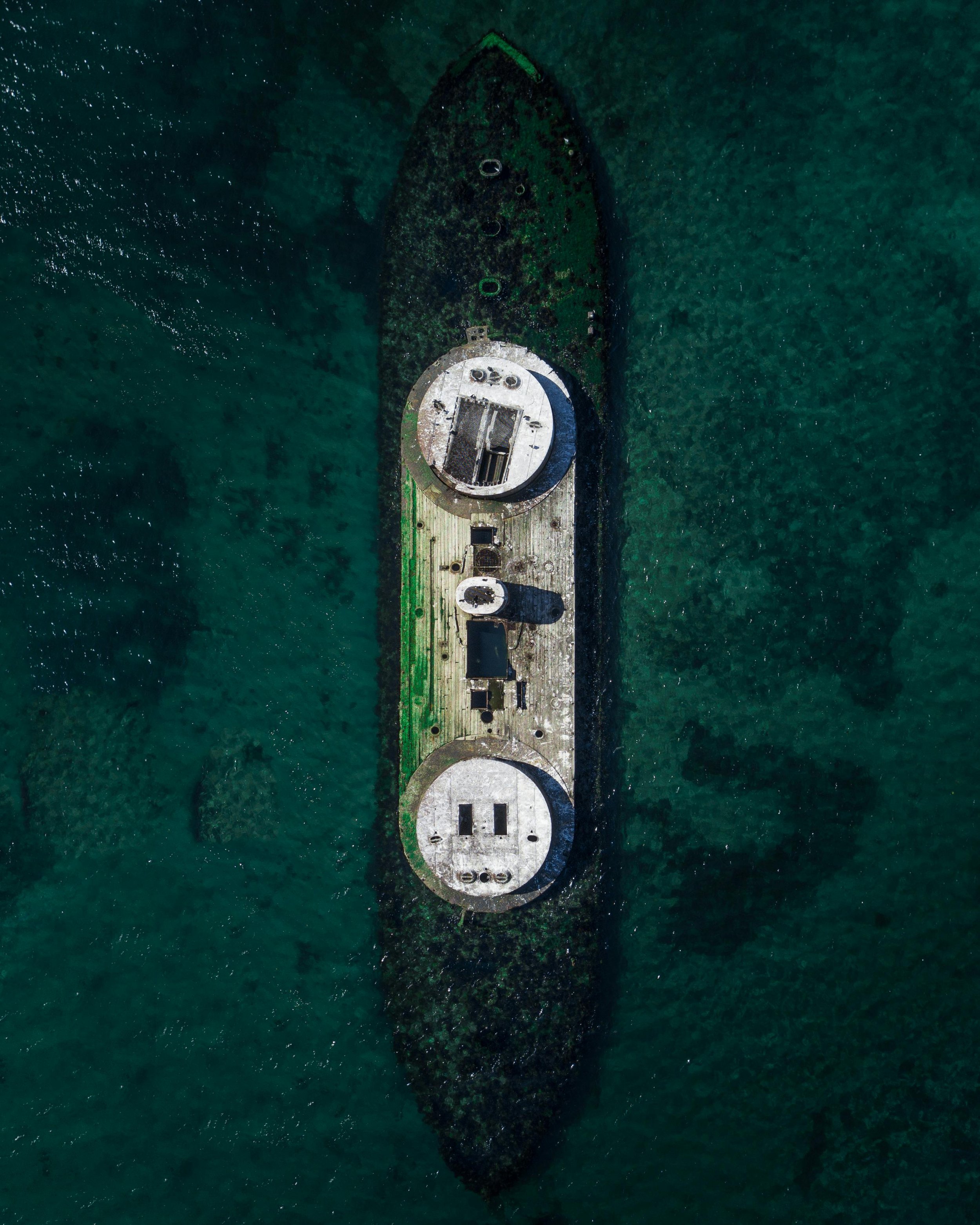
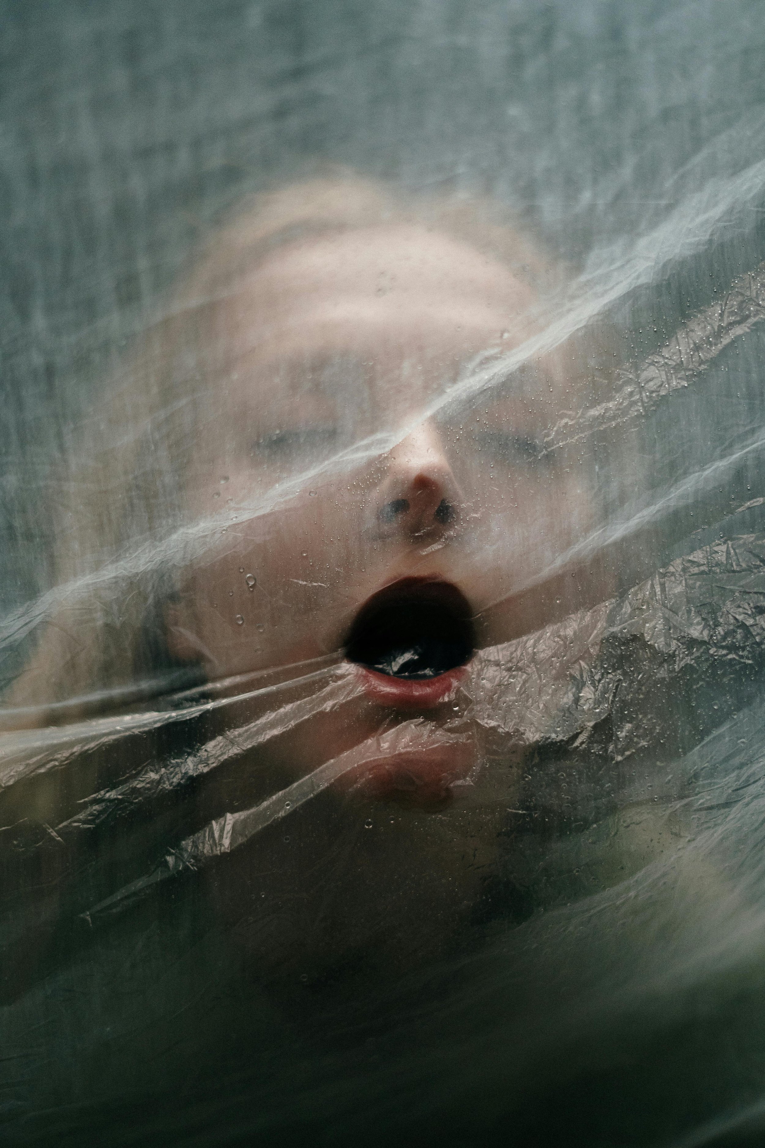
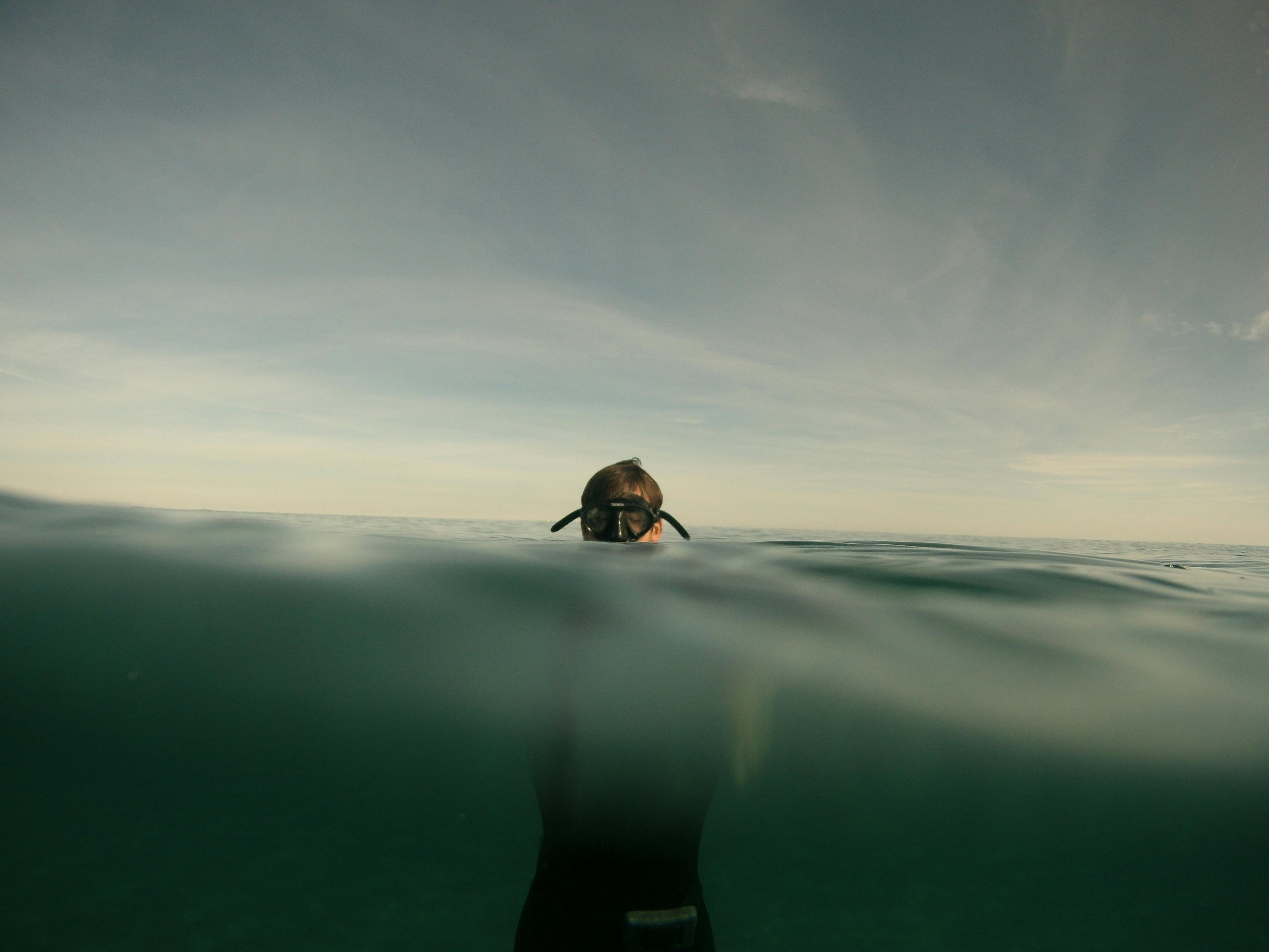
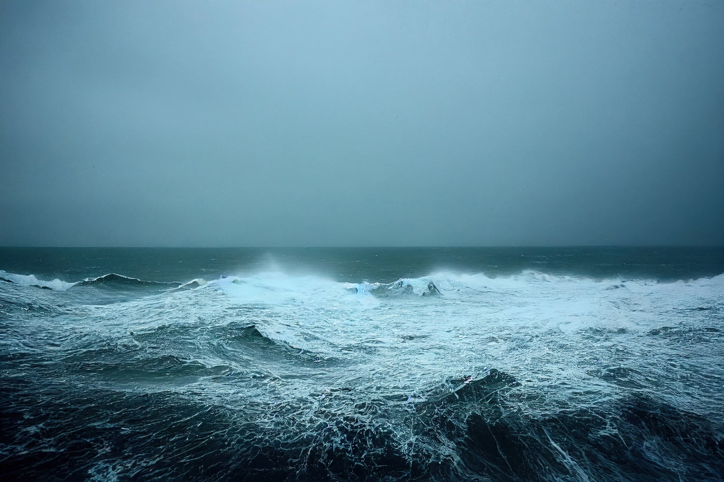
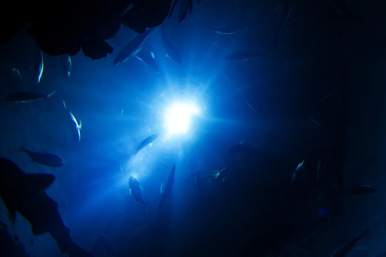
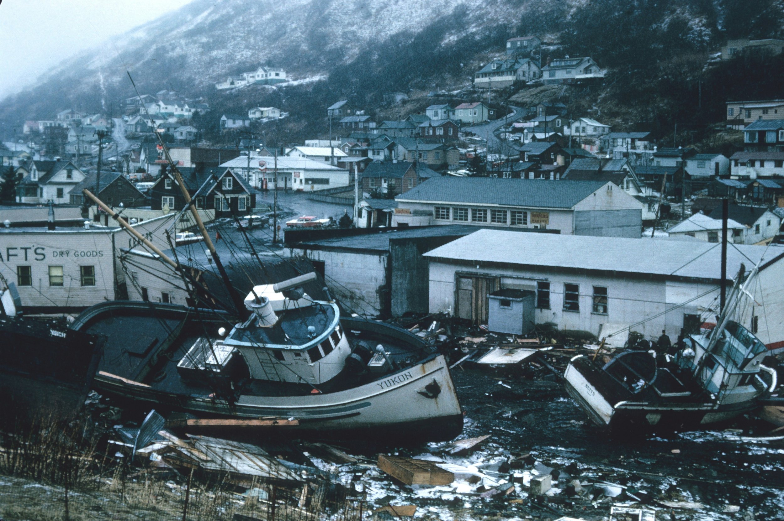
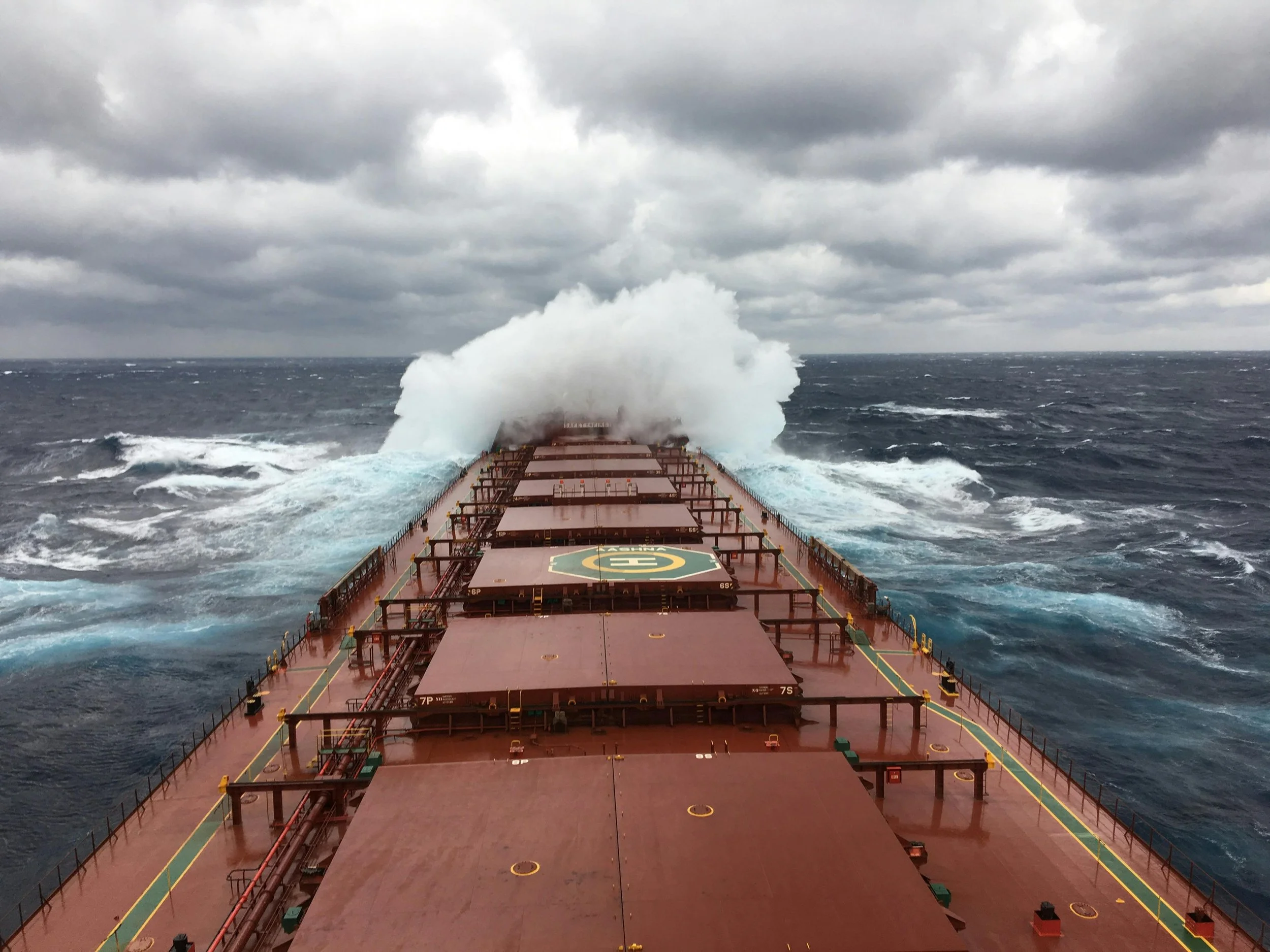
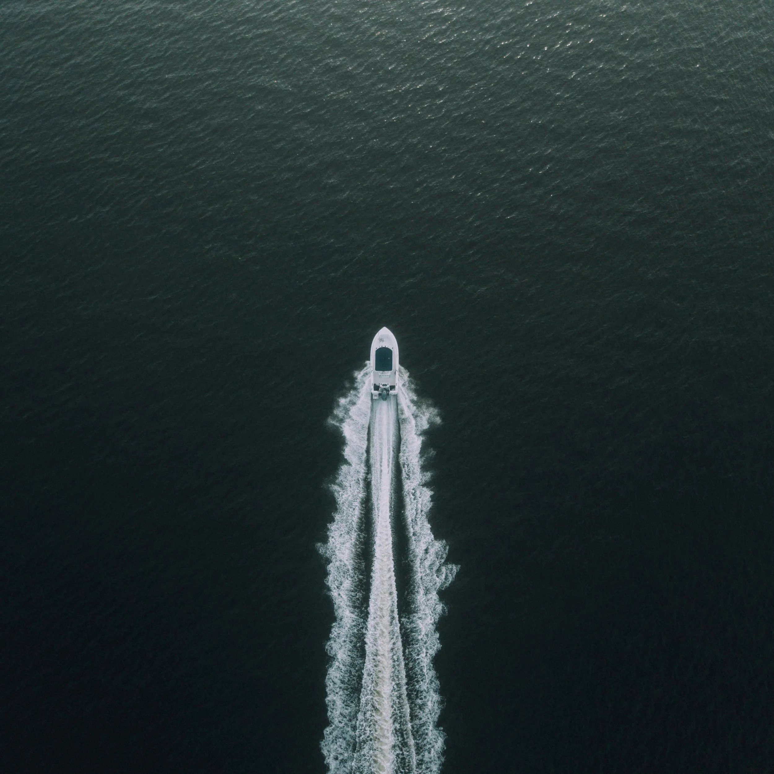
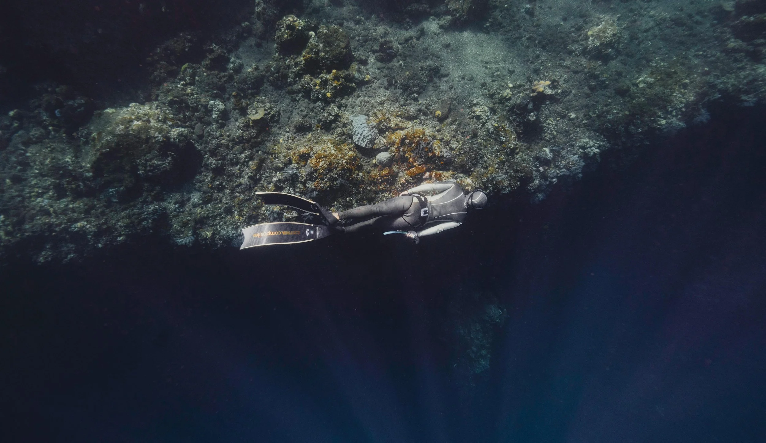
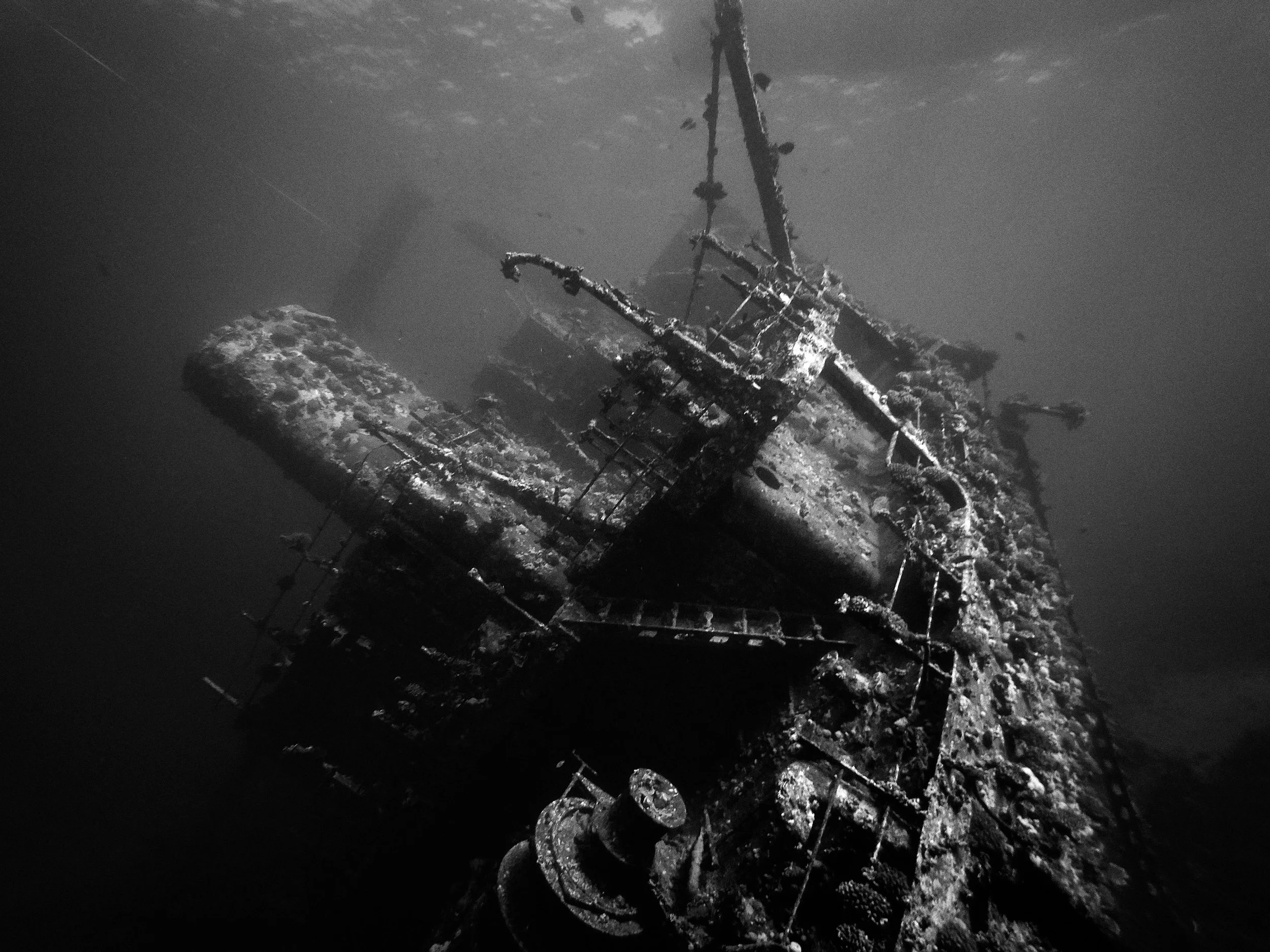
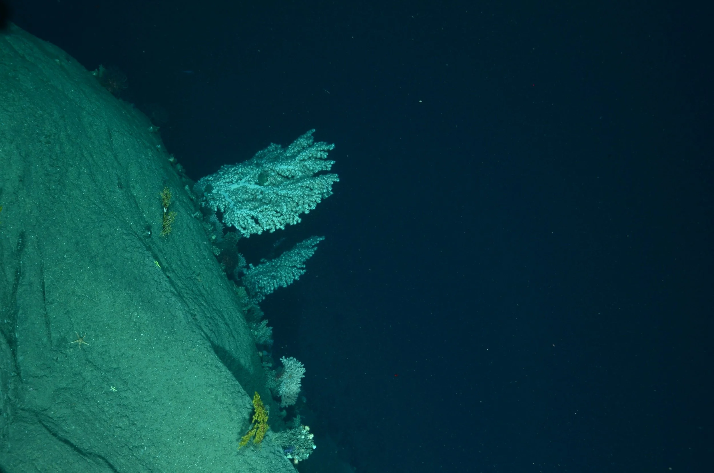
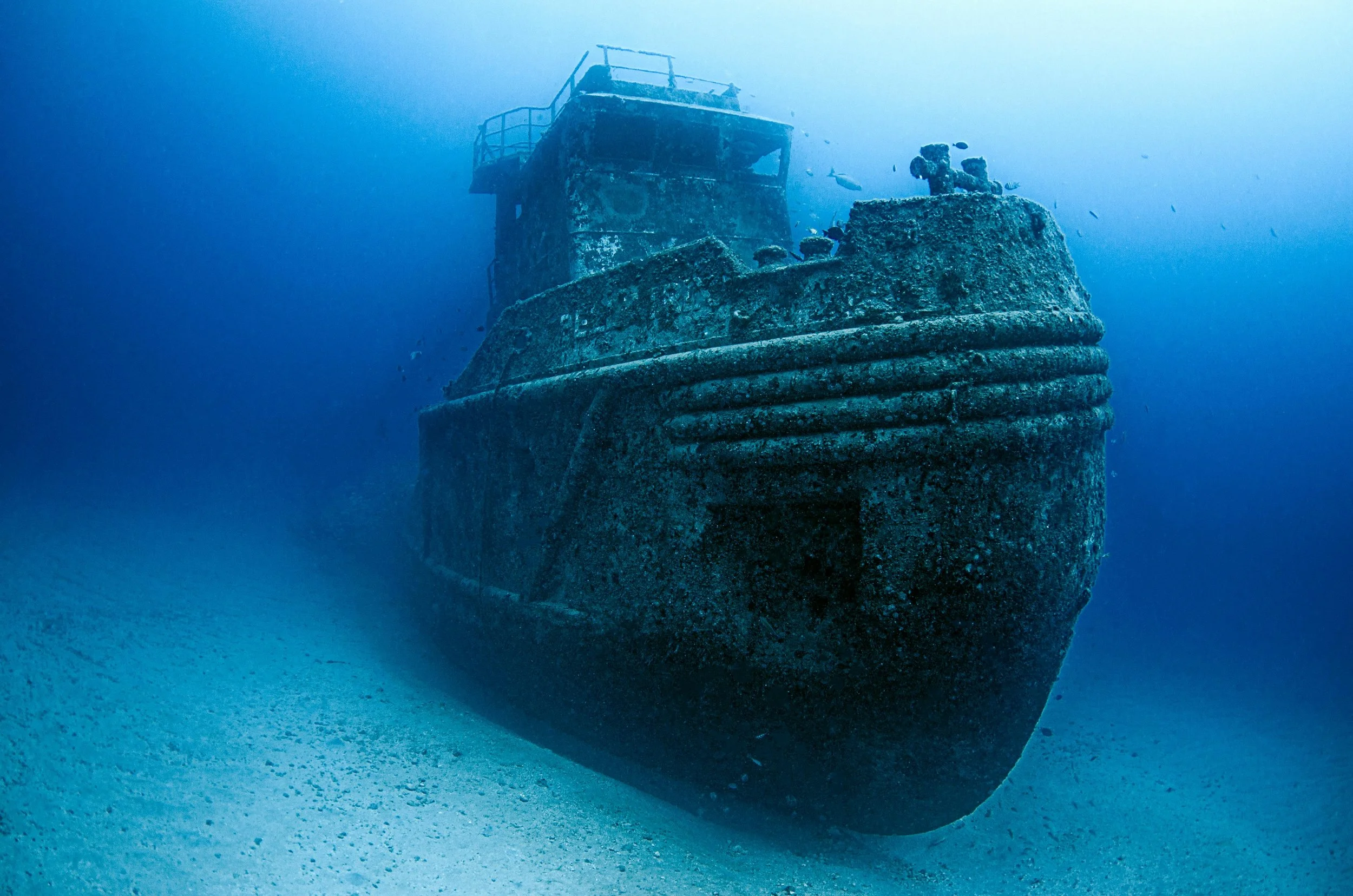
Building the Narrative Outline
SETTING -
Open Ocean
Cargo Ship
Lifeboat
CHARACTERS -
Protagonist(s) -
(Main Character) Atlas Walker
(Supporting Character) Colin Grayper
Crewmates/Coworkers
Antagonist(s) -
(Main Villain) Ocean/Mother Nature
Crewmates/Coworkers/Bosses
REFERENCES -
Video Games -
Subnautica (2014)
Iron Lung (2022)
Still Wakes the Deep (2024)
PLOT -
- Young man (MC) is determined to work a
dangerous job for his new family
- MC and SC work on board a cargo ship
- Cargo ship gets hit by two devastating
“rogue waves”
- MC and SC are forced to lifeboats
- (Lifeboats have one week worth of food and water.)
- They have two blankets and five flares.)
- The sea seems as if it’s trying to kill the young men
- MC and SC spend weeks alone at sea, together
- MC and SC get to learn more about each other
and their lives before they boarded the cargo ship
- MC and SC go through character development
- they battle the sea for survival
TWISTS/CLIMAX -
- Characters struggle with nature
(or elemental) threats. Such as, but not limited to…
Starvation, hypothermia, drowning, mental health,
marine life, natural disasters, etc.
- Characters realize that they’ve actually
known each other before the current events
- Characters disagree on vital decisions
- Characters imagine planning a life where
they’re neighbors and hang out together as
best friends in each other’s lives
- Important character dies (sacrificial)
RESOLUTION -
- One character survives (gets rescued)
- Character arrives back home
- Remaining character mourns his loss/copes
with “survivor’s guilt”
- Remaining character attends the others' funeral.
Color Palette
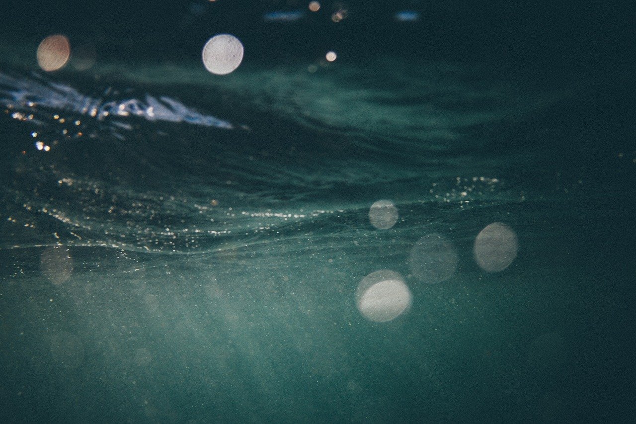
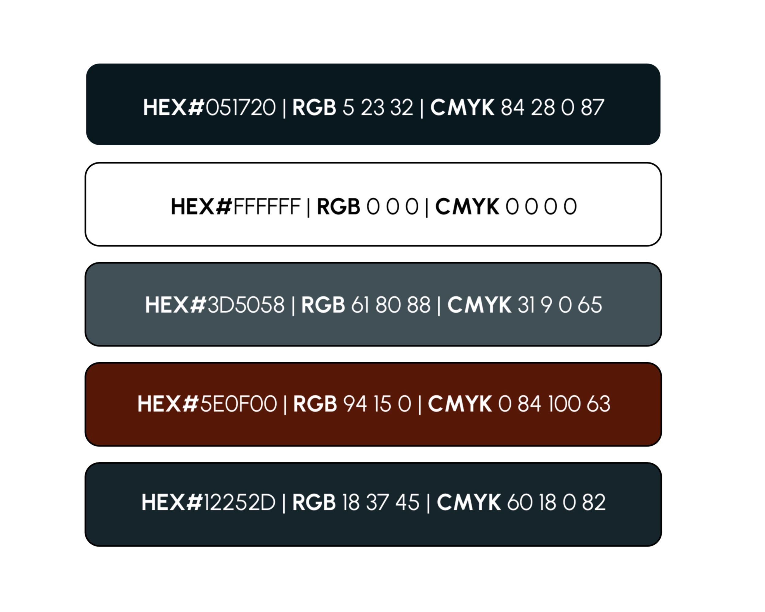
I chose a dark and desaturated color palette. The colors reflect isolation, danger, and uncertainty. This color palette psychologically pushes the feeling of uneasiness.
The deep blues and blue-grays represent the cold and overwhelming nature of the open ocean. The near-black tone emphasizes its unforgivable depth and darkness. The white creates crisp contrast against the darker shades. Lastly, the blood red represents danger and survival.
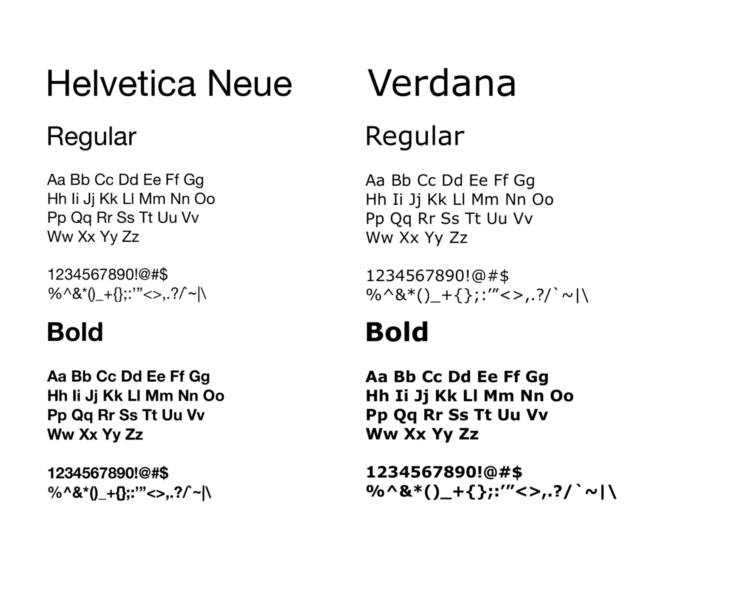
Typography
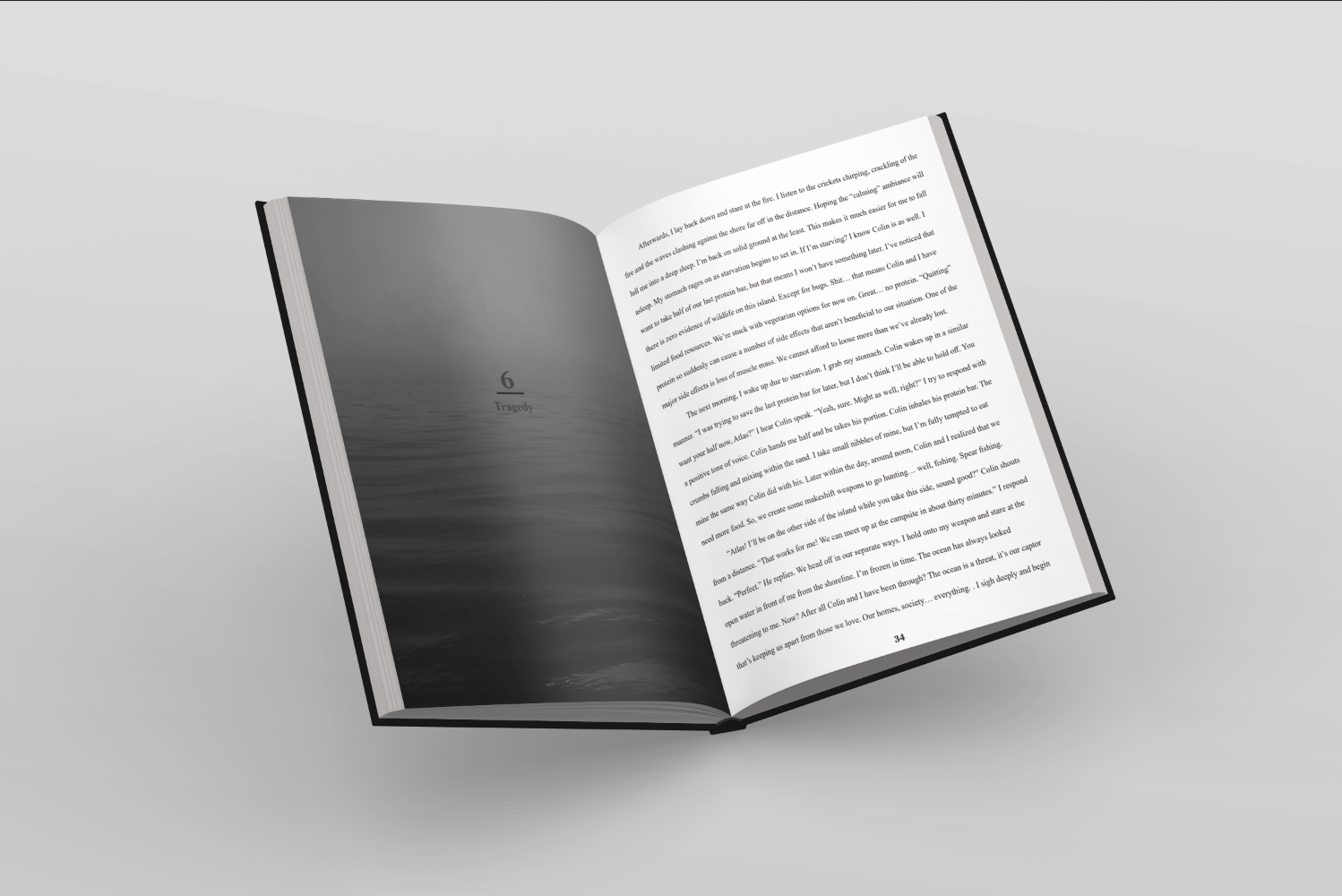
I wanted the typography to remain clean and easy to read against the darker atmospheric imagery throughout the book. Helvetica Neue and Verdana’s simpler sans-serif forms naturally create a modern and neutral appearance without distracting the reader from the events of the story.
Page Layout
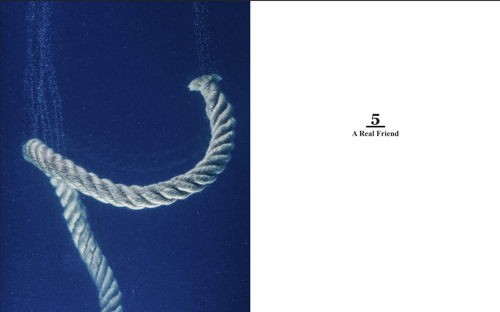
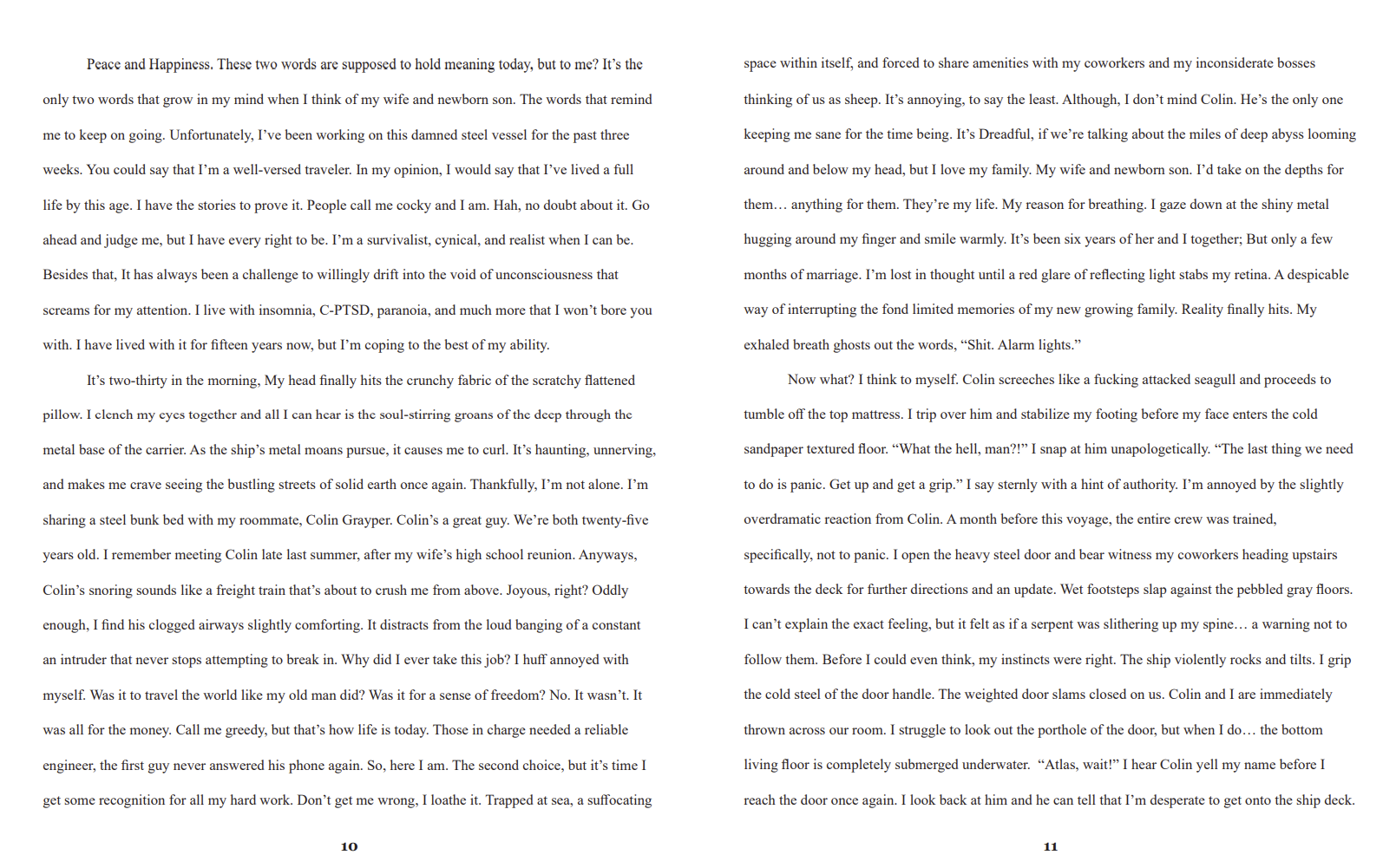
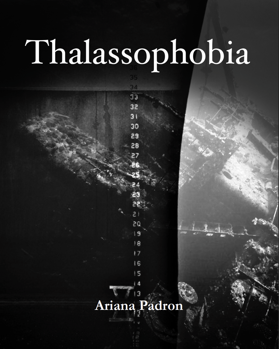
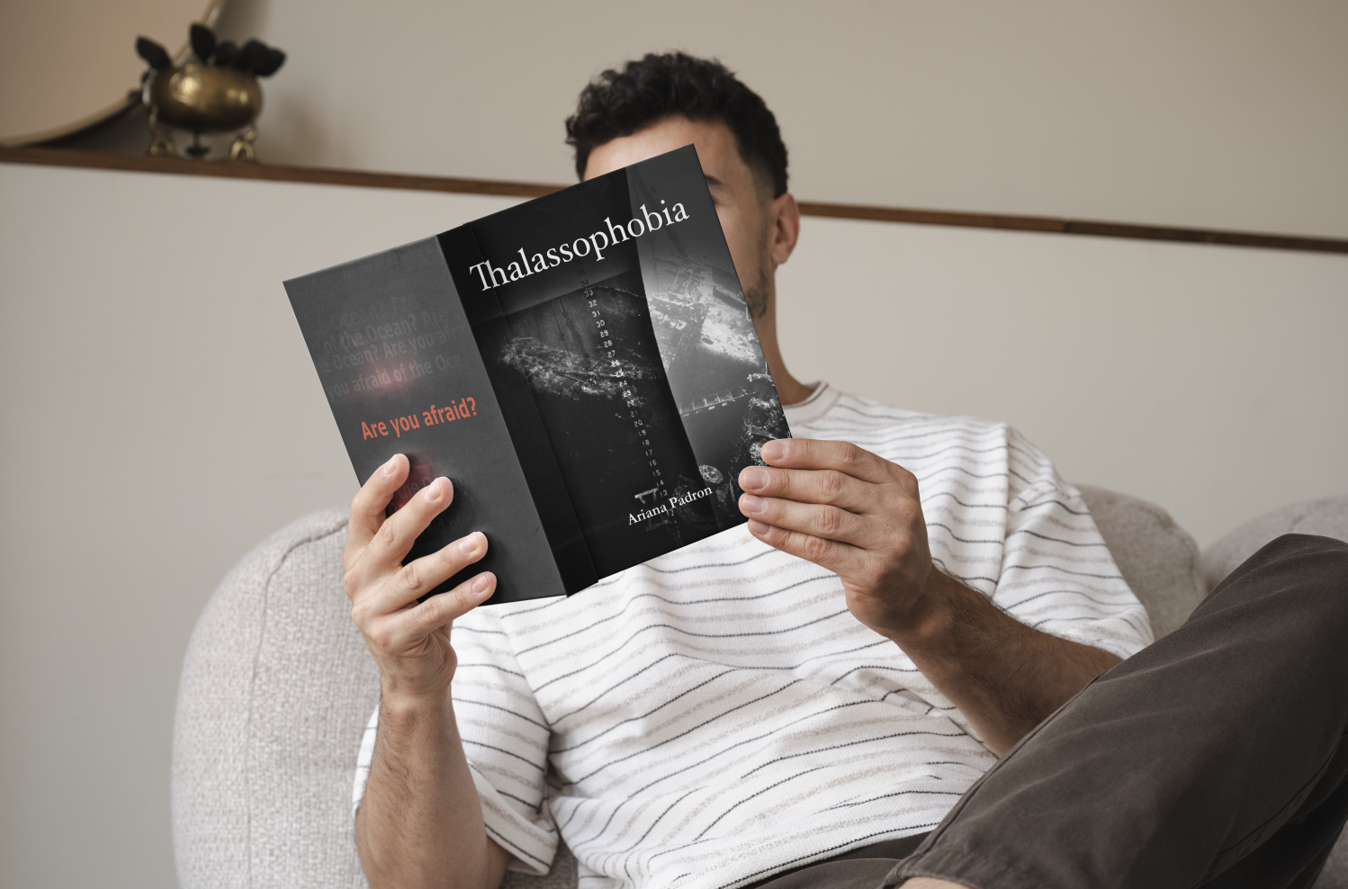
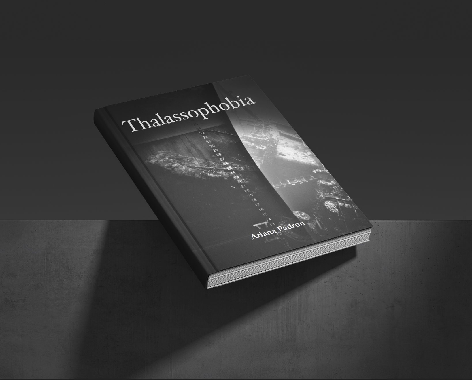
Front Cover
For the front cover, I wanted to visually represent both thalassophobia and megalophobia. The design is meant to make the reader/viewer feel small, vulnerable, and uncertain about what may exist beneath/around them. That stomach-sinking feeling.
Back Cover
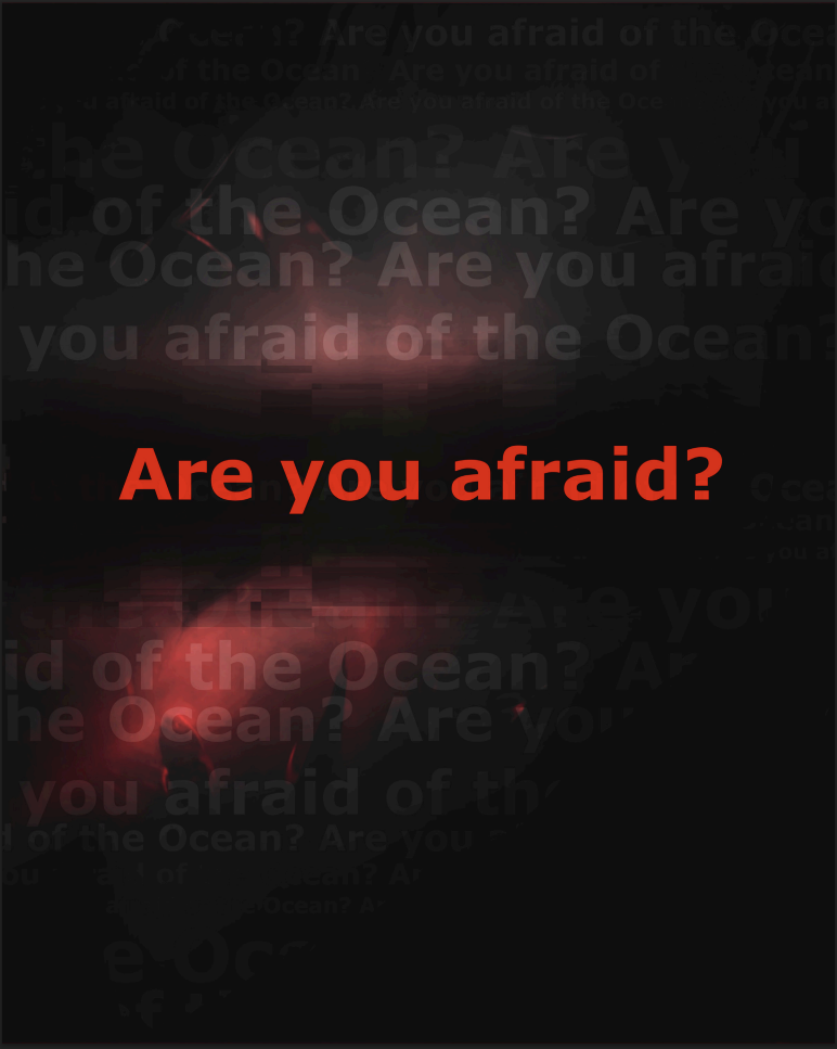
I approached a more psychological and personal aspect by asking the reader/viewer a direct question. It’s meant to grasp, intrigue, and push curiosity. I wanted it to be simple and emotionally provoking.
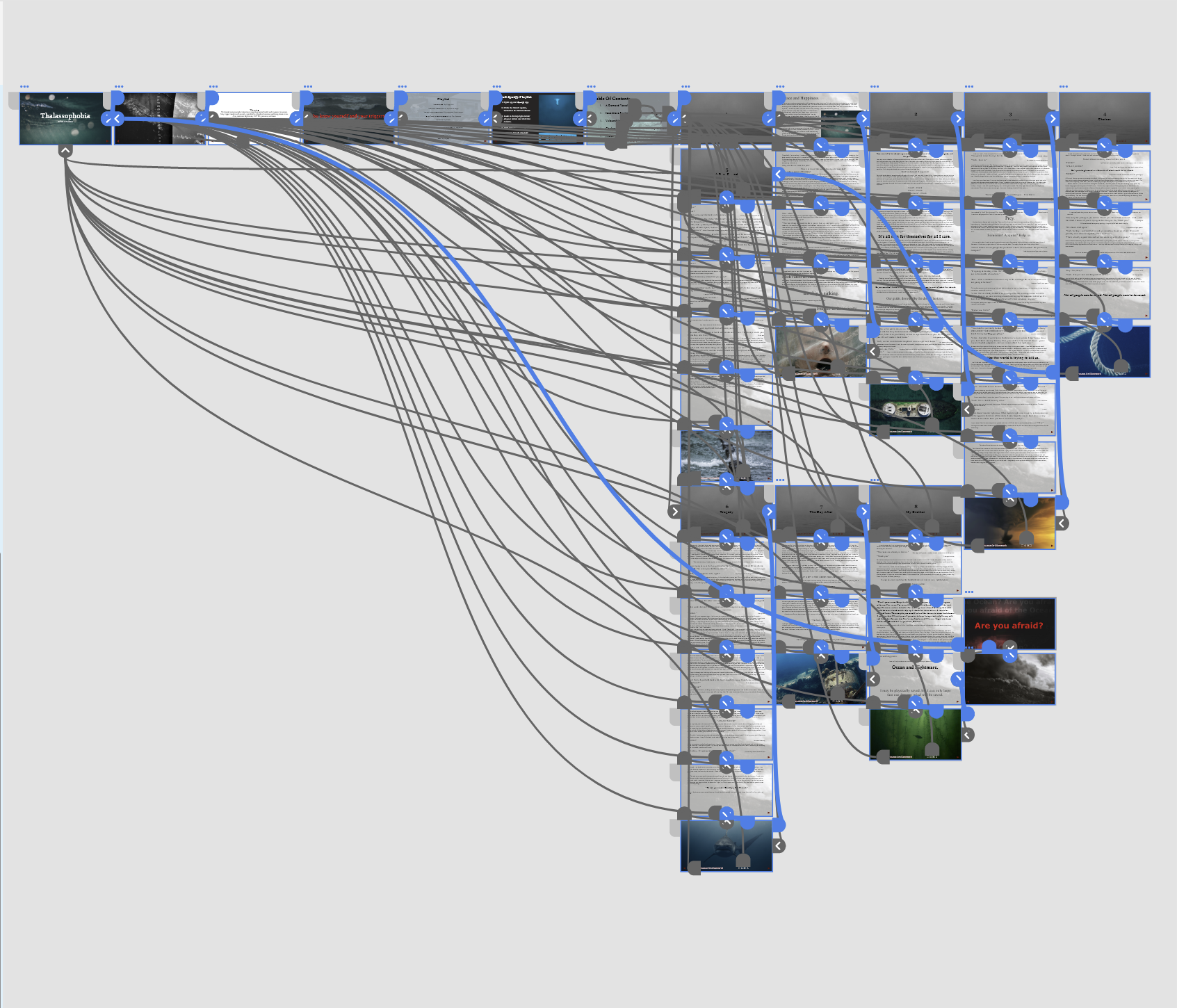
Created in Adobe XD, I put my entire book into a clickable digital copy. It’s working and available to read through!
(As soon as you arrive at the clickable prototype, right-click on the photograph to turn the page.)